A well-designed course isn’t just about great content, it’s about creating an experience that keeps your students engaged and motivated. Strong course design and layout improves comprehension, guides learners seamlessly through each module, and enhances overall satisfaction. Thoughtful ThriveCart Learn Course Design helps boost completion rates, reduce confusion, and deliver real value that keeps students coming back for more.
ThriveCart’s Learn offers you 3 highly flexible online course layout options that allows you to customize course templates to suit your brand, content, and your learners’ style:
- Sidebar
- Top Menu
- Grid (page)
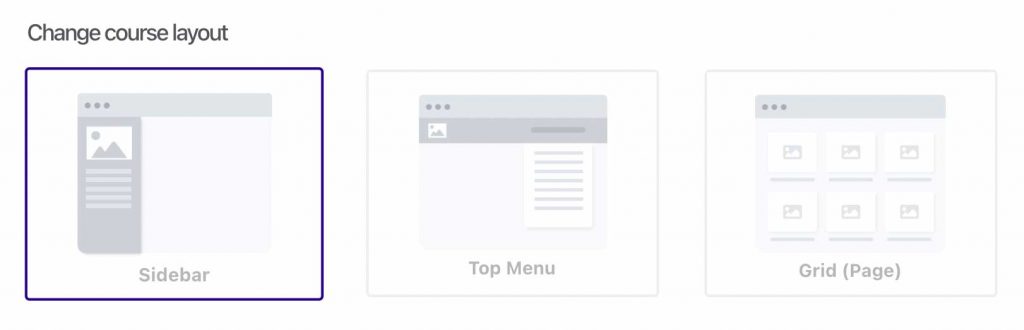
Each of these layouts allows you to choose how your content is delivered to your students. Each online course layout option is unique to the course, so you can mix different layouts within different courses in your account to best suit the training you’re offering.
Let’s take a look at these below (and remember these are the default styles, you can customize the colors and lesson content as you personally need).
Additionally, you can set images for your lessons and modules, which will be used as thumbnails where supported within a lesson layout.
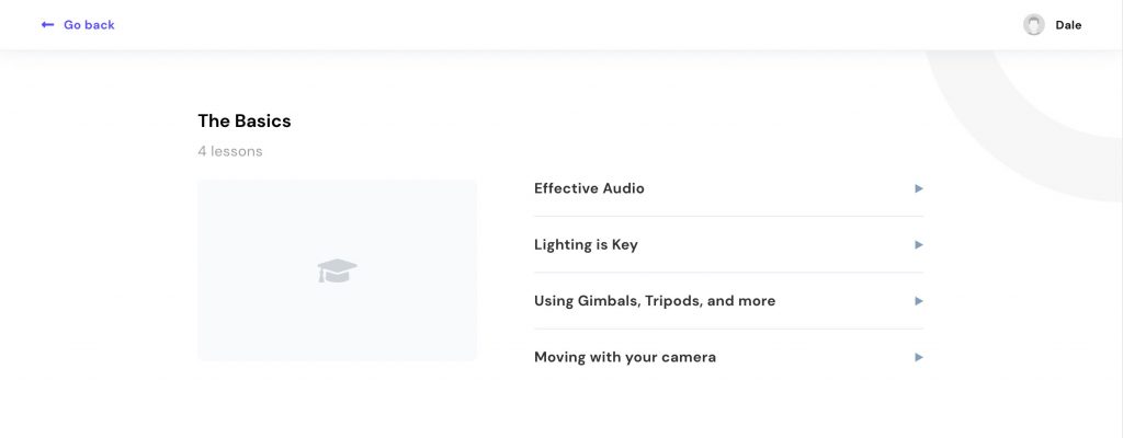
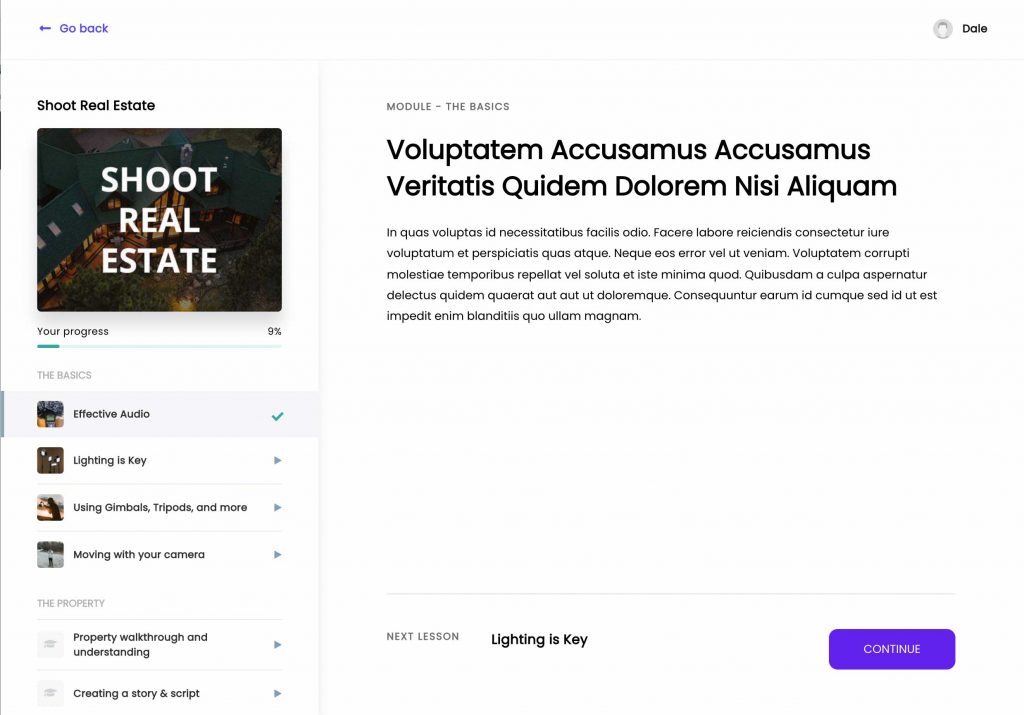
The Sidebar layout
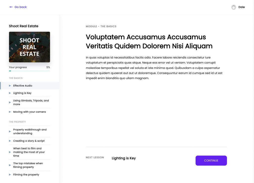
This layout features a list of your modules and lessons in the sidebar, a sidebar that can be adjusted in width based on your needs, full-color customization to fit your brand, and of course – lesson completion indicators when a lesson has been completed by the student – allowing them to easily see what they have already finished.
All lesson content in the main lesson area is completely customizable with our drag and drop editor letting you easily add text, images, embed video, and more.
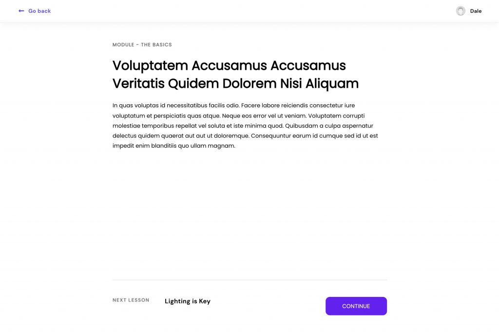
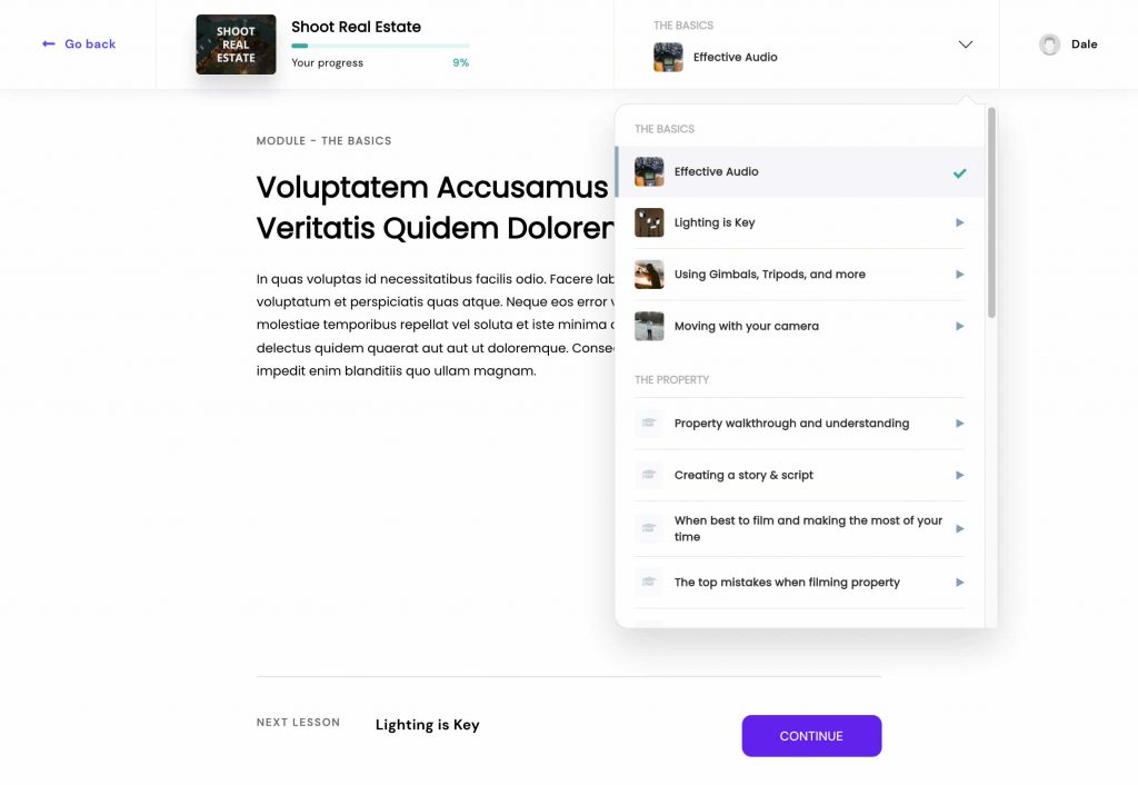
The Top Menu layout
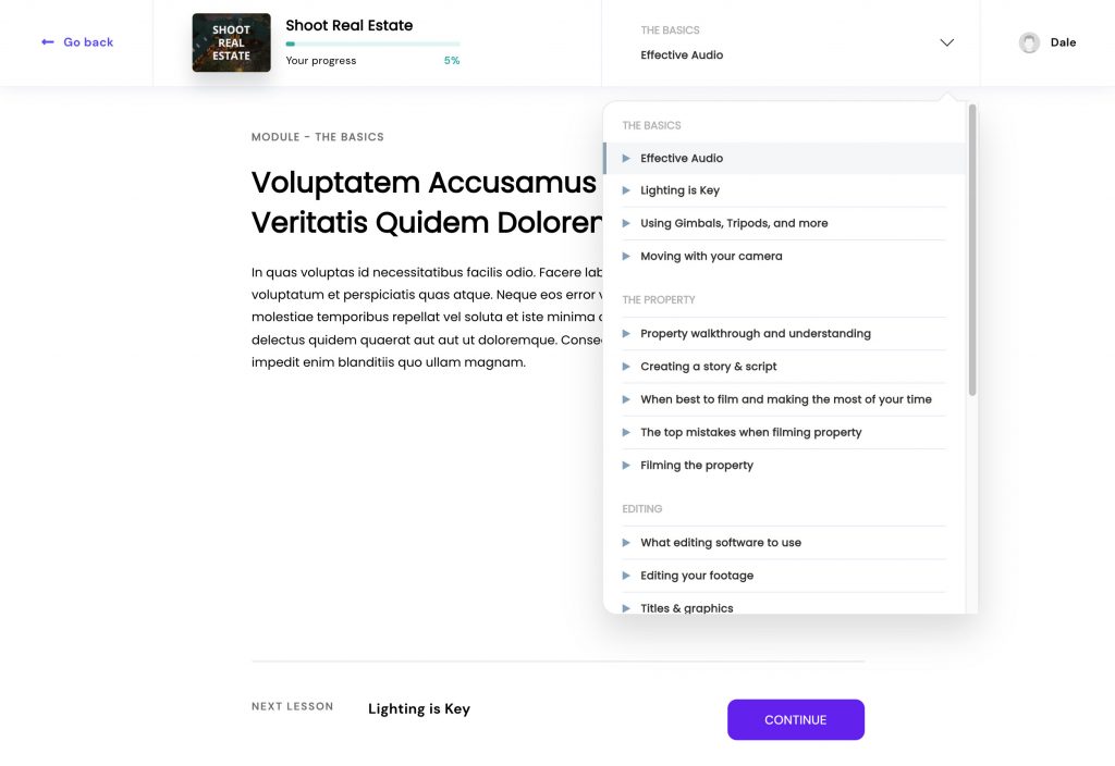
The Top Menu is an ideal eLearning content layout that is aimed at creators where the lesson content is the sole focus. With this layout, we’ve removed the sidebar and added everything up in the top menu.
Students can continue through your course using the “Continue” button at the bottom of your content (this button text can be customized by clicking into it), or they can click on the drop-down menu in the header to see a list of the modules and lessons available to them.
The Grid (page) layout
The Grid layout is a little different from the above two options, as it has several levels.
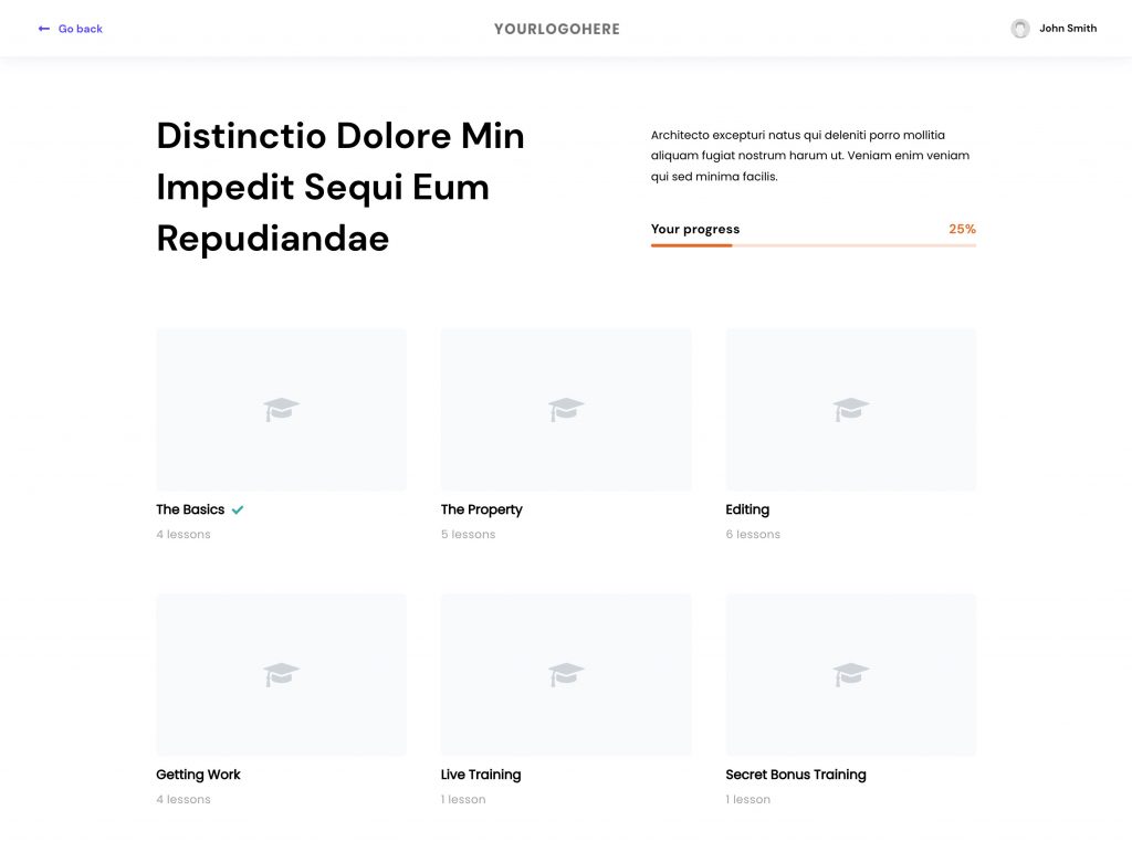
When using this online course layout option, you’ll have a customizable page where you can drag and drop elements around a Grid of your course modules. You can see with this layout, the use of thumbnails is encouraged to give visual immersion for your students.
When a student clicks on a module, they’ll be taken to the module overview page with a list of all the lessons available within that module.
Finally, when clicking on a lesson, they’ll be taken to that focused lesson page similar to the Top Menu layout – only with fewer distractions for your students.
To add thumbnails to your lessons and modules, you’ll access that setting within the course editor page directly:

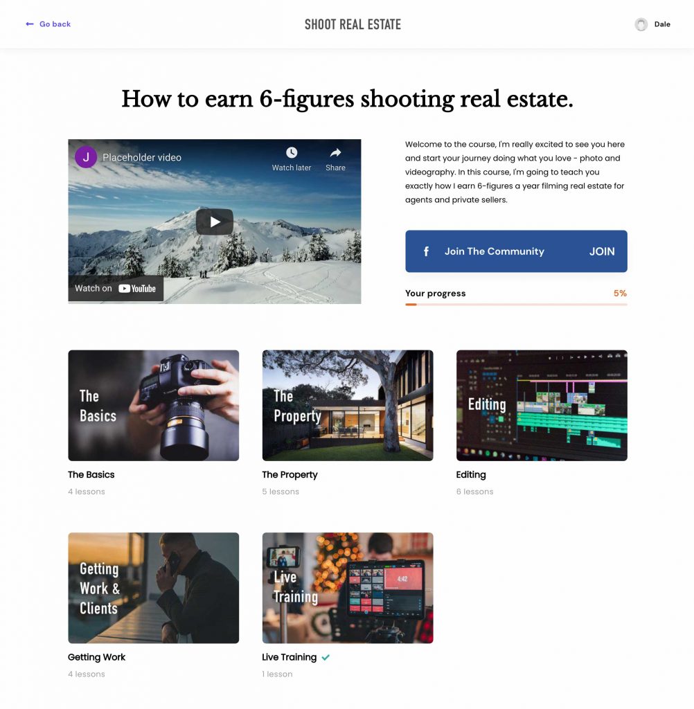
eLearning content layout examples
In the example below, we’ve taken the Grid layout, positioned the header and title of the course, added a video introduction and a link to join the Facebook community. Beneath, we have the thumbnails for the different modules the student has access to.
Below is an example of a module page with another video introducing the module (again you can drag and drop your elements here as you’d like to present it to your student). Under the module lessons, we’ve added an FAQ related to the lessons in that module.
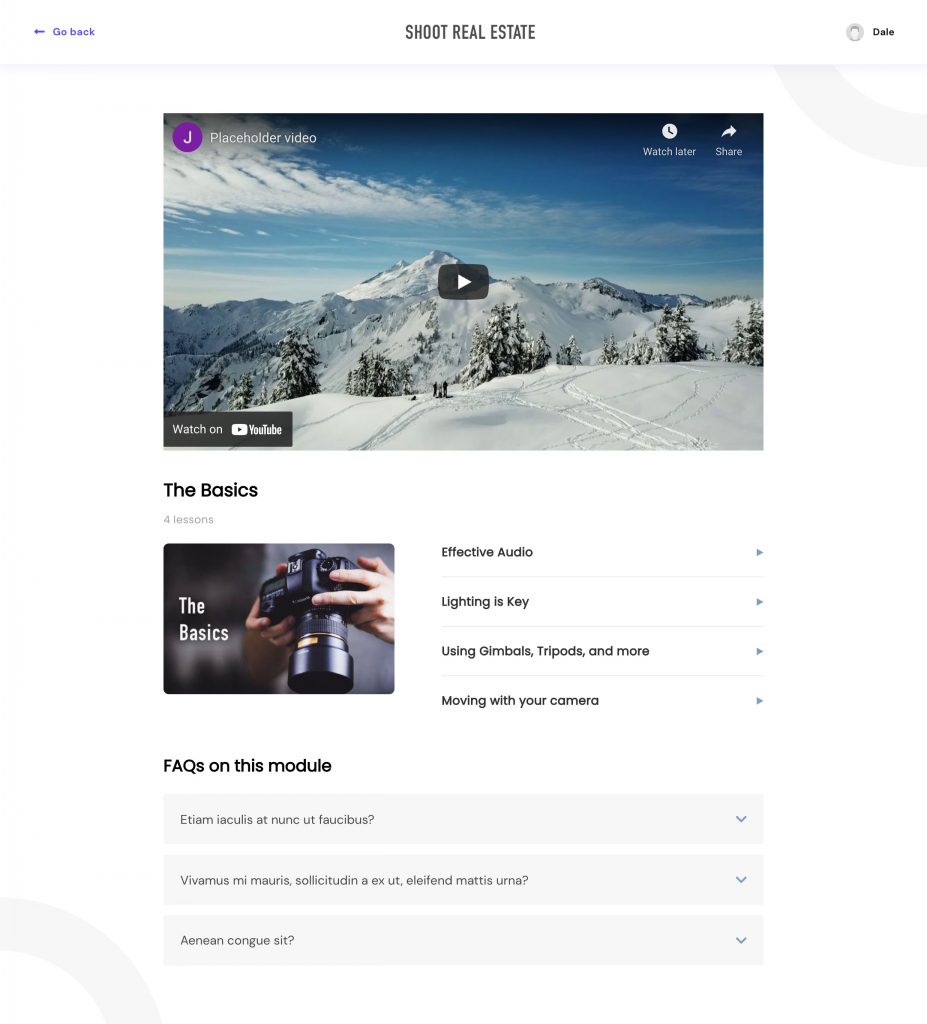
Not only can you add thumbnails to your modules, but lessons can also have thumbnails and when added, they’ll be shown next to the lesson titles in the lesson selections. For example, in our dropdown menu, we can see the first module has all its lessons with a thumbnail.
The Sidebar layout also includes those thumbnails when added.
You have a ton of flexibility with how your course content is shown to your students. And aside from the layout options, you have full-color customization to bring it all in line with your own personal branding as needed.