Designing a high-converting checkout has never been easier with the ThriveCart cart editor. Our drag and drop cart editor gives you complete creative control to customize every element of your page—no coding required.
Customize professionally designed ThriveCart templates to match your brand, optimize user experience, and maximize conversions effortlessly. From fine-tuning layouts to adding upsells and funnel pages, the ThriveCart checkout builder gives you total control over your checkout’s look and performance.
Enhanced Editor
Below is an example overview of the new and improved editor when working with a new template:
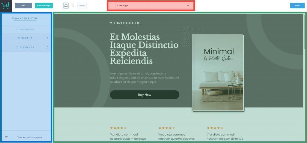
When you select an element in the main editor area (right-hand column), you’ll have a range of options shown in the left-hand column, letting you change the settings of that element. Some elements will even let you select sub-elements, such as text or images so that you can further customize the very individual pieces.
When selecting the Blocks/Elements options within the left-hand column, you will be able to drag and drop those elements into the editor area (right-hand column). You can then rearrange elements once they’re added to the editor area.
All of your checkout pages (cart, upsell, downsell, success page) can be found within the dropdown (top-middle). You’ll also be able to connect an existing funnel item here as well. See more on creating funnel items in our guide: Creating a funnel and upsell pages.
Blocks
All “new” template designs are built using the new Blocks feature. You can customize these checkout blocks fully by opting to keep every design element that’s pre-built into these blocks, swap blocks out, adjust their colors, and even disable certain design elements entirely.
There are a number of block types that can be added to your checkout page design to make your checkout page truly your own:
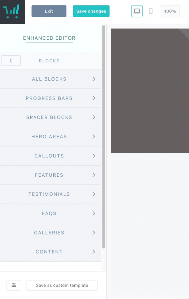
- Progress Bars help to showcase where in the checkout process your customers are and can be placed throughout your sales page
- Spacer Blocks add gradient colors between your designed blocks for a touch of flair between your other elements. You can also drag page elements into these spacer blocks to build out and design other sections for your page
- Hero Areas are typically used for your header section of your page and where you’d showcase your product with an image or video and where your main sales headline/subheading would go
- Callouts help you to showcase your product pricing or special offers
- Features pre-built text boxes to help you detail your product offering and inclusions
- Testimonials feature images and text boxes to showcase customer reviews
- FAQs with dropdowns and Q&A formats that allow for color and formatting customization to help detail answers to frequently asked questions
- Galleries offer the ability to highlight product imagery and visual content
- Content block elements are basic video, image, and text-based blocks
These blocks are interchangeable between templates, can be mixed-and-matched, and color customized to fit your branding and to get a truly one-of-a-kind design to showcase your product and branding.
Overlays
If you’re looking for a festive-designed checkout based on year round holidays, you can find our pre-designed overlays to give your checkout some flair. You can see more in our guide on enabling overlays here.

Saving Template/Blocks (to reuse)
Once you’ve designed a sales page that you’re happy with, you may wish to save that template so that it can be used across other products or with other ThriveCart users.
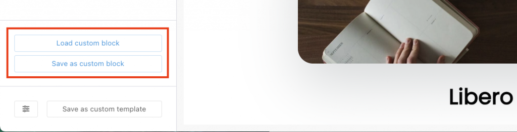
To do this, you can select the “Save as Custom Template” button in the bottom left of the editor, where you’ll see a pop-up asking whether you want to make it shareable and what you want to include in the template.
When you save a template, this will also be available in your ‘My templates’ area of your design gallery, and you can reuse this on other products and funnels.
Additionally, if you’re just wanting to save specific blocks or elements from within an Enhanced checkout to reuse easily across other pages/products, then you can also use the save/load custom block/element in the bottom-left of the editor when either element is selected.
Classic Editor
The Classic Editor can be accessed when choosing a “Legacy” Template. These templates are a bit more simplistic than our block-based options in Enhanced, but still allow for high levels of customization and brand-ability.

After choosing a Legacy template from your product’s checkout page settings, the checkout type that you’ve chosen will load. Unlike our Enhanced Editor, which has a plethora of designs and styles to choose from, the Classic Editor offers 4 simple designs:
- Standard – a sidebar style checkout
- Sales Cart – a full page checkout
- Pop-up – a pop-up or modal checkout that can be embedded into your own custom page (this option will not give you a checkout URL, but embed code)
- Embeddable – to place your checkout directly into your own website (this option will also not give you a checkout URL, just embed code)
For example, the “Standard” sidebar checkout allows you to set a right or left sidebar, with a number of elements that you can drag & drop into your checkout design.

Content Boxes
Content boxes in the Classic Editor operate similarly to Blocks in our enhanced editor. You can add a content box above/below your checkout in the editor, where you can drag and drop elements into these boxes.
Saving Template/Elements (to reuse)
In Classic, you can save “elements” within your editor, such as text elements, image elements, etc. that you can then reuse on other products. These buttons would say “Load custom element” or “Save as custom element”.
To save the entire Classic Template to be re-used on other products, or to generate a Share URL that other ThriveCart users can use to import your design into their account, you would be able to access this from your product settings “Customize” tab:

You can see more on sharing templates and using Share URLs in our guide here. From this customize tab, you will also have the option to “Copy design from another product” – where you can choose from other products to automatically add that product’s design to your checkout.
If you choose a product with an Enhanced template, the editor version will switch to Enhanced – and vice versa.
Both Enhanced & Classic
While there are some nuanced differences in layout between our Enhanced and Classic editor version, there are a number of similar functions that both editors share.
Elements
Elements are types of content that you can drag and drop into your ThriveCart checkout builder in order to customize your checkout design further. These elements include things like text boxes, images, videos, FAQs, a countdown timer, HTML, etc.
- In Enhanced, these elements can be added in to blocks
- In Classic, these elements can be added into your checkout section, or in to content boxes
You can add elements into blocks on your page or checkout area.
Saving your Checkout page design
Once you have completed the checkout design of your product, you would want to click on the “Next” button at the top-right of the cart-editor and click the “Complete” button to save your work.
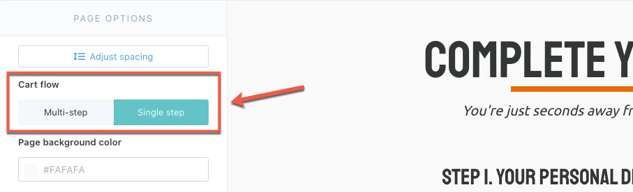
Multi-Step vs Single Step Checkouts
Every checkout can be set as a single-step or multi-step checkout from within the ThriveCart checkout builder to choose how you are collecting data from your customers.
A single step checkout requires all customer details to be input on the same page before the customer can complete their order, while multi-step checkouts break the steps down even further and create a secondary page where payment information is collected.
To switch between the two, you can select the option in the left-hand menu.
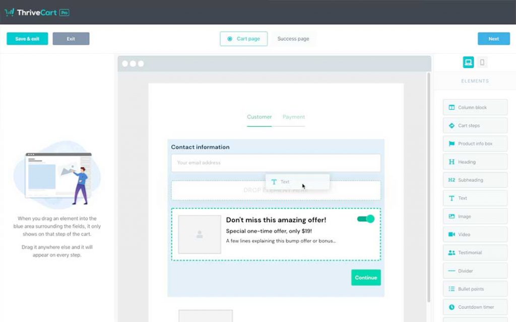
Something else to note with Multi-step checkouts is that you can have content set to show only on specific steps, giving you a huge amount of customization.
When you go to drag or move elements around, you’ll see a blue shaded background appear (see below for example). This symbolizes the content area for that Step. So anything added within that area will only show on the step that you’re on.
For example, you could drag the bump offer element out of this area into the general page section, switch to the payment step, and then move the bump into this step.
That way, the bump offer would only show to customers when they get to the payment step and not before.
Checkout Page Optimization
The ThriveCart checkout builder enables comprehensive checkout page optimization through:
- Our responsive checkout designs are automatically optimized for mobile and desktop
- Conversion-focused template layouts – in addition to standard checkout designs, we have a number of Lead Captures templates that are pre-built with specific niche and business models in mind.
- A/B testing capabilities are available to compare checkout elements to determine which performs better. See more here.
Troubleshooting
| Problem | Solution |
|---|---|
| Editor isn’t loading | If the editor isn’t loading for you do not save. You’ll want to exit without saving, log out of your account, and clear your browser’s cache. When logging back in, that editor should now load your design without issue. |
| Design didn’t save or has gone missing | If your design has gone missing, reach out to our friendly support team and they can look into quickly restoring to a previous save version for you. Include the URL when viewing the product in editor, as well as the date/time that it was last correct. This can happen if: you’re sharing your login email/password with someone else, or logging into your account from another device, this could log you out in the backend and cause saves to become corrupted or not reach our servers. Additionally, if you’re leaving your dashboard idle for some time, do make sure to log out/log back in before making any edits/saves to your products as an idle dashboard can also become logged out in the backend. |
| Text that cannot be edited | When selecting a section, most text – especially the pre-written sections – can be adjusted within the right section in the editor (by clicking onto that text directly). Some areas, such as fields in the checkout, are hard-coded into the system, but can be adjusted by using Custom Text & Translations. |
| Certain Blocks or Elements cannot be deleted | Some sections, such as the success page block with pre-populated information, as well as the pricing summary, cannot be deleted within the editor. If the block or element you’re trying to delete is a simple text or image, then reach out to support and the team can take a look. |