Building professional checkout pages used to require design skills, coding knowledge, or expensive developers—but ThrivePages changes everything. With intuitive sections that structure your page layout, drag-and-drop elements that add functionality in seconds, and powerful properties that let you customize every detail, you can create stunning, high-converting pages without touching a single line of code.
The visual builder in ThrivePages puts complete creative control at your fingertips—no design degree required, no technical barriers, just point, click, and publish beautiful pages that convert.
Introduction to Sections, Elements, and Properties
Sections are the structural containers that organize your page into distinct areas—like headers, hero sections, feature lists, and footers. These full-width page separators provide the foundation and layout structure that holds your elements in place.
Elements are the building blocks of high-converting checkout pages—text, images, buttons, videos, and checkout forms that guide customers to purchase. The ThriveCart page elements library provides professional components to create checkouts and sales pages that convert.
Properties are the customization settings that control how each section or element looks and behaves. From colors and fonts to spacing and animations, the element properties in ThrivePages gives you precise control over every visual detail without writing code.
Working with Sections
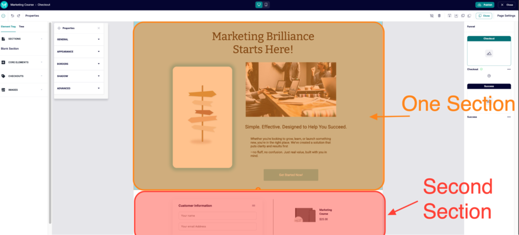
Sections are full-width containers that organize your page into distinct areas. Each section has its own independent 200-column grid.
What sections do:
- Span the entire 1280px page width
- Contain unlimited rows of elements
- Have independent backgrounds, spacing, and styling
- Help structure pages into logical areas (hero, features, testimonials, checkout, footer)
Adding sections:
Click the Sections > Blank Section button in the top left element tray to automatically add your first section, or add an additional section at the bottom of your page. A new empty section is inserted at that position.
Selecting sections:
Click in the empty space of a section (not on an element) to select that full section. The Properties Panel shows section properties, where you can edit the background color, borders, and add naming structures for that section.
Within the Tree selector in the top left, you can quickly click into an element to highlight and edit that element directly.
Deleting sections:
Select the section, then click the Delete button on your keyboard or click the trash can icon in the top right. The section and all elements inside are removed.
What are Elements?
Elements are the content blocks you add to sections—text headlines, product images, call-to-action buttons, checkout forms, testimonials, and more. Each element serves a specific purpose in your sales funnel, from capturing attention (hero images) to collecting payment (checkout elements).
Properties are the customization controls for each element. Every element has a Properties Panel where you adjust appearance (colors, borders, shadows), behavior (links, hover effects), and layout (spacing, sizing). Changes apply in real-time on the canvas.
Think of elements as the building blocks and properties as the paint and styling you apply to make them match your brand.
- No coding required – Visual controls replace the need for CSS and HTML knowledge
- Brand consistency – Save colors and styles to reuse across all pages
- Conversion optimization – Professional elements designed for checkout performance
- Speed – Pre-built elements accelerate page building from hours to minutes
Common Section & Element Properties
Every section and element has it’s own unique Properties available when it’s selected, but they all share common properties as well. To access the properties panel, click into a section or element, and click the Properties option within the top toolbar.
This properties panel can be moved around your canvas to prevent overlapping your content, just grab the top of the panel and move to your desired location.
Each element will have unique properties that you can control, but the common properties across all sections and elements include:
General: Set the element name to help with identifying the specific element within your element tree and organization. IDs are auto-generated and can be used for custom CSS targeting.
Appearance: Set a solid color for the section or element’s background
Borders: Add borders to sections and elements, setting the border color, radius, and whether it has rounded corners. Use 5–10px radius for a modern feel, or 50% for pill or circle shapes.
Shadow: Add depth with adjustable offset, blur, spread, and opacity. A natural shadow typically uses 4–8px vertical offset, 12–20px blur, and 20–30% opacity.
Advanced: Assign custom class names and style them via Page Settings > Custom Styles. Best for advanced users who need styling beyond the built-in options.
Understanding the ThrivePages Element Library
The Element Tray in the left sidebar organizes all available elements by category, and is where you’ll go to add content to your page. The available elements are:
Core Elements
- Text – Headlines, paragraphs, formatted text
- Panel – Colored background containers for grouping content
- Button – Call-to-action buttons with hover effects
- Line – Horizontal or vertical dividers
- HTML Element – Custom code blocks for third-party embeds (can currently be used for video embed functionality)
- Testimonial – Customer reviews and social proof
- Countdown Timer – Add a timer to increase purchase urgency
- Video – Embedded videos (via URL from YouTube, Vimeo, Wistia, etc.).
Checkouts
- Checkout – Complete checkout form with payment processing
- Bump – Standalone bump element that can be moved anywhere on your page
- Guarantee Seal – Trust badges (14-day money-back guarantee included)
- Product Info – Dynamic product name & price pulled from product settings, description to be set in editor
- Order Details – Dynamic order information (only available on success pages)
- Purchase – One-click buy button (only available upsell/downsell pages)
Images
- Image – Photos, graphics, logos, product images
Not yet available, but coming soon:
- Icons – Visual icons from a built-in library (thousands will be available)
- Form – Lead capture forms (VBOUT integration)
- Accordion – Expandable FAQ sections
Adding Elements to Your Page
You can easily add elements to your page by dragging and dropping them into position. When dragging an element, position your cursor at the top left corner where you want your element to be placed.
- Open Element Library (left sidebar)
- Find the element you want
- Click and hold on the element
- Drag it to your desired position on the canvas
- Position it using the grid (snaps automatically)
- Release to place
- Adjust the elements position by clicking and dragging again, or pull the white boxes to adjust size
ThrivePages Element Configuration: Core Elements
Text Elements
Text elements display headlines, subheadlines, body copy, and formatted content. Drag the Text element onto your canvas, double-click to enter edit mode, then type or paste your content.
The formatting toolbar in the top navigation bar becomes available only when text is selected, and provides styling options such as bold, italic, underline, strikethrough, text and highlight color, links, alignment, lists, and heading styles (H1, H2, Paragraph).
Properties:
- Font family – Choose from Google Fonts
- Text Structure – Set text as a heading (1 or 2) or paragraph for easy styling
- Text color – Overall text color
- Font size – Set in pixels. Common sizes are:
- Body: 16-18px
- Subheadings: 20-24px
- Headings: 32-48px
- Hero: 48-72px
- Font Style – Bold, Italics, underline, text alignment, bullet type & style
- Hyperlink – Opt to link text to an external link, or choose an existing section for an internal page scroll. To hyperlink to an existing element, that element must have a name set in “General”.
Panel Elements
Panels create colored background containers that can be used for organizing and highlighting content, or simply to create visual interest on your page.
Once you’ve dragged a panel into your canvas, you can access the Properties panel to adjust the background color and borders, and then drag/drop other elements in front/behind it such as text, buttons, or images.
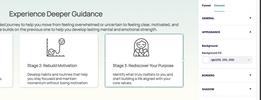
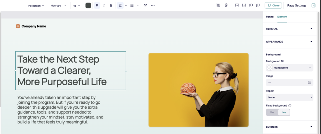
Image Elements
Drag the Image element onto your canvas and choose from your Media Gallery or click + Upload. Resize by dragging the white handles on the element’s outline.
Supported formats: JPG, PNG, GIF, WebP, SVG
ThrivePages automatically optimizes images by resizing to the appropriate dimensions, as set when adjusting the size on the grid.
💡 Tip: Upload high-quality images (we recommend at least 1920px wide). ThrivePages optimizes them for web delivery while maintaining quality. Smaller low-quality images may not be adjusted to fill the entire space.
Image Properties:
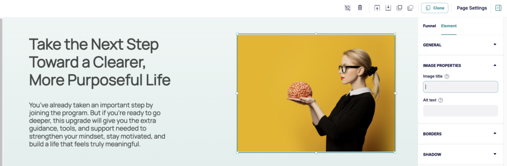
- Image title – Set the title attribute for SEO
- Alt text – Describe image for accessibility and SEO (e.g., “Illustration of a plant with leaves and a butterfly resting on it”)
Button Elements
Buttons are primary call-to-action elements guiding customers to take action. These buttons can link to external sites, or to existing sections on your page.
Drag a Button element onto your canvas, and position it where you would like (typically below text or images). The default button appears with placeholder “Submit” text.
Button properties:
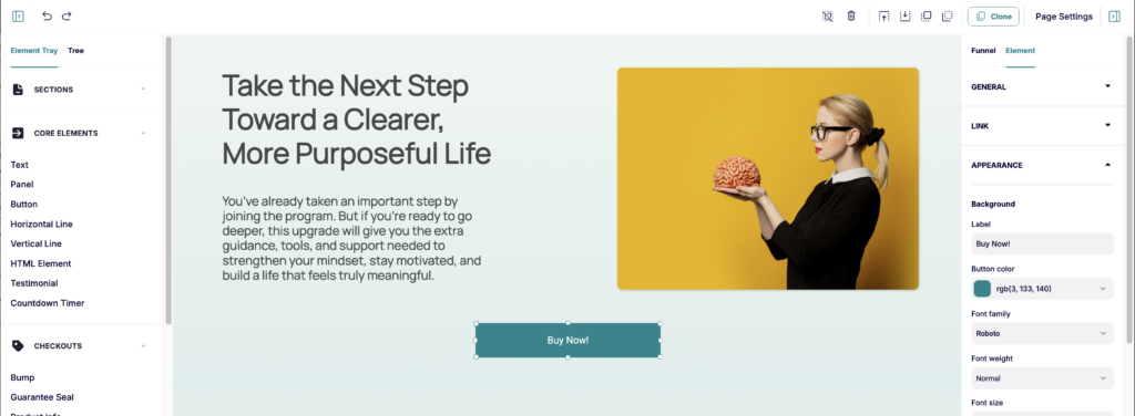
- Link – Adjust the settings related to where this button will direct customers
- Element Link – Link to external website
- Internal Link – Smooth scroll to additional section on page (i.e. your checkout section)
- Appearance – Set text font style, size & color
- Button label – Text on the button (use action-oriented text: “Get Started Now,” “Add to Cart,” “Yes, I Want This”)
Button Best practices:
- Use action-oriented labels and contrasting colors that stand out from the background
- Add buttons in your hero section and link internally to your checkout section for a fast scroll-to-purchase experience. Make sure to name your checkout section in the checkout elements “General” properties so that it’s available via the internal list.
- Keep buttons large enough to tap on mobile (4-cell height recommended)
- Avoid vague labels (“Submit,” “Learn More”), too many buttons per page, or hiding your primary CTA below the fold
Line Elements
Lines create visual separation between page sections or content blocks. You can add a horizontal line to span the width of your page, or a vertical line to span the height of a section/page.
In line properties, you can set the color and line thickness. The line thickness is set in pixels, where 1-3px is the most commonly used design-wise.
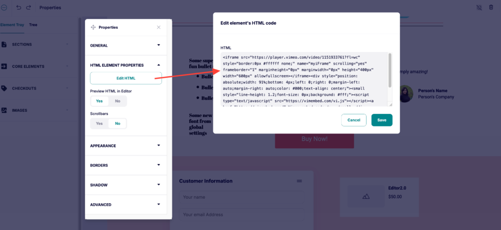
HTML Elements
HTML elements embed custom code such as third-party widgets, forms, calendars, and social media feeds. Common uses include: Social Media feeds, custom widgets and scripts, video embeds, autoresponder signup forms.
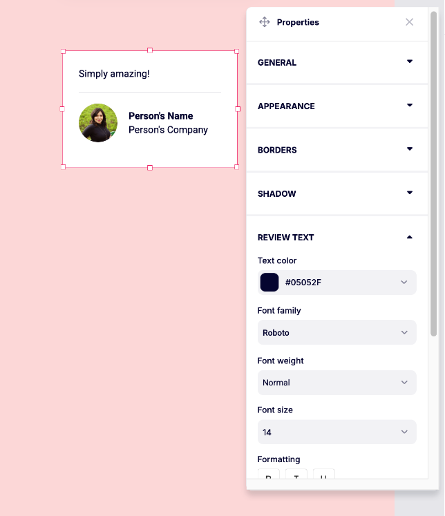
Testimonial Element
The Testimonial element showcases customer reviews and social proof. You can edit the text and images within this element by clicking into them directly, and then set text and image styling within the element’s properties.
Within the Testimonial elements properties you can set the customer name, title, review text font styling, and photo (optional).
Include real names and photos where possible, keep quotes focused on specific results, and place testimonials strategically — before checkout, after feature sections, or interspersed throughout long-form copy.
Countdown Timer
You can set an Evergreen or Fixed countdown timer by dragging the Countdown Timer element into your page.
For details on timer functionality, see our full guide on using countdown timers here, but new properties available for the timer in ThrivePages include:
- Set Timezone: In our legacy editors, the timer would assume either your browsers timezone or your account default, but you can now choose the desired timezone for your timer.
- Add multiple timers: Adding multiple timers throughout your page is supported. Set unique timers, or apply properties to all timers on page.
- Add to funnel pages: Timers can be added to upsell pages, but note that upsells will always automatically be considered declined if a user sits on the page for 60 minutes.
- Live countdown: See the timer actively counting down directly in the editor
Video Elements
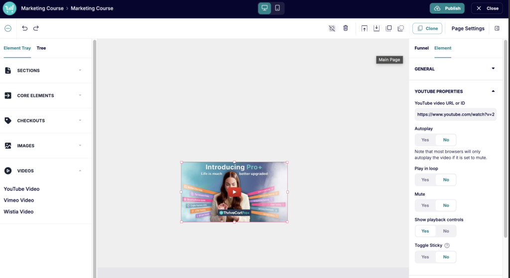
While ThriveCart does not currently host videos, you can drag and drop the video element of your choice from the left-hand sidebar into your section to embed videos from Youtube, Vimeo, or Wistia.
Once the element is placed on your page, a Properties field unique to your video host will open giving you the ability to set the video URL and settings. Just grab the URL of your video – no video embed code needed!
Video Properties:
- Autoplay [Available for YouTube, Vimeo, Wistia] – Video starts automatically when page loads
- Play in Loop [Available for YouTube, Vimeo, Wistia] – Video restarts when finished
- Mute [Available for YouTube, Vimeo, Wistia] – Start video with sound off (required for autoplay in most browsers)
- Show Playback Controls [Available for YouTube only]- Show play/pause and volume controls (recommended)
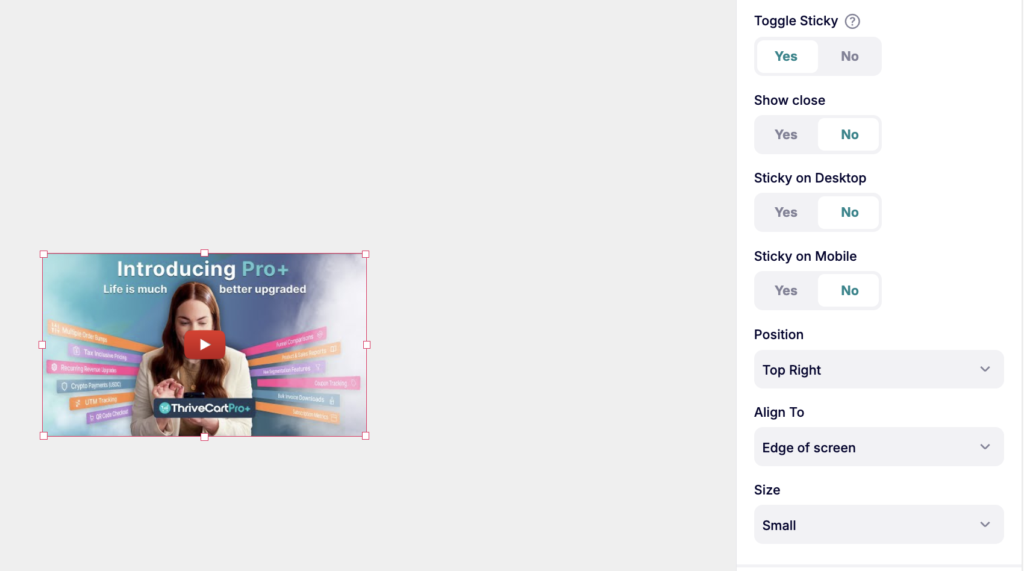
- Toggle Sticky [Available for YouTube, Vimeo, Wistia] – Choose whether to keep video playing in a popup if the user scrolls past a playing video. When enabling, a number of settings become available to determine where it should stick (mobile and/or desktop), where (pop-out to edge of screen or page, as well as the positioning of the video), and the size of that pop-out video.
Checkout-Specific Elements
Checkout elements handle everything payment-related across checkout, upsell, and downsell pages. See our ThrivePages: Funnel Pages article for full details.
The Checkout Element
The checkout element pulls in your product’s pricing summary and configures the fields customers complete at purchase. Email is required by default, but you can also enable:
- Email verification, customer name, business name, contact number, VAT number
- Billing address (full or selective fields)
- Validation fields: Terms & Conditions, Refund Policy, email opt-in checkboxes
The Payment Information section is a preview only — your live checkout reflects the payment methods enabled on your product and the customer’s eligibility. All sections within the element (including the coupon code field, if a coupon is enabled) can be reordered by dragging. Bump offer details also appear here, if configured within your products settings first, with controls for the special offer banner, image visibility, and the option to hide bumps.
Guarantee Seal Element
Displays trust badges from your media gallery. A default 14-day money-back guarantee image is included, but you can upload any image to use as a guarantee seal.
Place near checkout elements or below pricing to reduce purchase anxiety. Swap with a custom badge via Replace seal and always set Alt text for accessibility. The default size is 5 × 2 grid cells.
Product Info Element
Displays dynamic product details (name, price, description) and updates automatically to reflect taxes, shipping, and discounts. Available on checkout, sales, and funnel pages. Not to be confused with the Order Details element.
Order Details Element (Success / Thank you pages only)
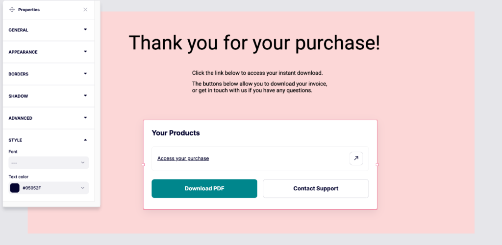
The Order Details element displays dynamic order information on success pages to include your product links and buttons for invoice downloading or to contact your support email/visit your support webpage, based on what is set within your product’s fulfillment settings.
This element is only available when editing the success page, and pulls data automatically from the completed transaction. No configuration needed.
Within the order details Properties panel you can adjust the background color, set text font and colors.
There are however different element views depending on your main products fulfillment method:
- Show Invoice
- Send to a URL
- Add to membership
Purchase Element (Upsell / Downsell pages only)
The Purchase element is a one-click buy button specifically for upsells and downsells. This element is only available to add to an upsell or downsell page. (See more on creating your funnel in ThrivePages here)
When to use:
- Upsell pages (visible to every customer already entered payment info at checkout)
- Downsell pages (alternative offer that will only display after declining upsell)
Properties:
- Button text (“Yes, Add This to My Order”)
- Button styling (same options as Button element)
- Set links for upsell/downsell product fulfillment
Element layering (Z-index):
Within the ThrivePages elements grid system, you can set elements to overlap. As you build out your page, you may wish to change which element appears on top.
When you select an element that is overlapping another element, the layering buttons will allow you to move that element to the front/back or up/down a layer.
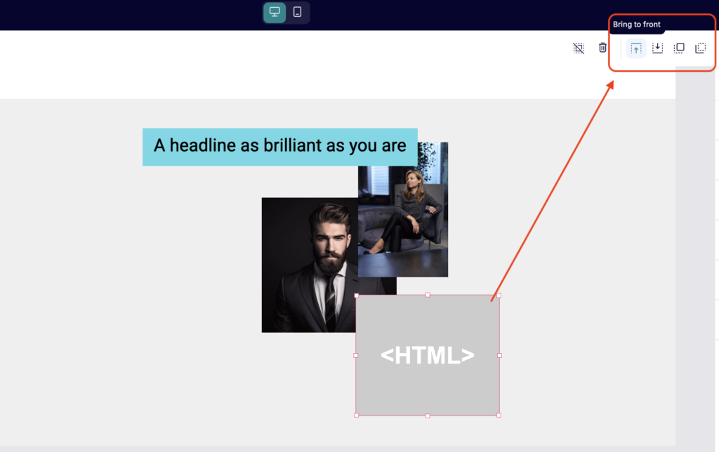
For example, you may want to place a Panel element behind text, images, or buttons to add a colored background or design element to highlight that text.
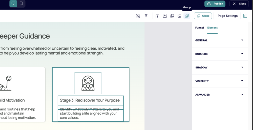
Grouping Elements
Often you may have headlines + body text + panels or images that you may want to group together so that you can easily move them alongside each other. This can be accomplished by selecting those multiple items (using the shift key on your keyboard + clicking on multiple elements), and then using the “Group” option that appears in the top navigation bar:
Troubleshooting
Issue: I can’t see the grid lines on my canvas
Solution: The grid is invisible by default, but you can move elements anywhere you wish and elements will snap to the hidden grid.
Issue: My element won’t position where I want it
Solution: Elements snap to whole grid cells, not pixels. They can only be positioned on cell boundaries. If you want finer positioning, try resizing the element or adjusting which cells it occupies. Elements cannot be placed between cells—this limitation ensures professional alignment.
Issue: The canvas looks different than my published page
Solution: The canvas is always 1280px wide for editing consistency. Your published page is responsive and will adapt based on your screen size. View your checkout in an incognito window (after saving your overall product) to confirm how it looks on the front-end. Check both desktop and mobile modes.
Issue: I deleted a section by accident and lost my work
Solution: The Undo function in the top navigation bar works for all recent actions. If you’ve made other edits since deleting, you may need to press Undo multiple times to get back to before the deletion.
Issue: I can’t see the Properties Panel for my selected element
Solution: The Properties Panel appears at the right of the editor. If you don’t see it, ensure you’ve clicked an element (blue outline should appear). If the panel is collapsed, click the Arrow tab at the top right to expand it. If you still don’t see properties, try clicking a different element then re-selecting the original.
Issue: My custom colors aren’t saving in the color picker
Solution: Colors are currently saved to pages only, not the entire funnel.
Issue: My element is behind another element and I can’t select it
Solution: Use the Layer Tree (left sidebar) to select elements by name. Click the element in the tree to select it, even if it’s hidden behind other elements on the canvas. Once selected, right-click and choose Bring to Front to move it above other elements.
Frequently Asked Questions
- Q: How do I make elements the same size across multiple pages?
- A: Select an element and note its grid dimensions (shown when selected—e.g., “12 × 3 cells”). On other pages, select elements and resize them to match those cell dimensions by dragging corners. For pixel-perfect consistency, duplicate the styled element (Ctrl/Cmd + D), copy it to other pages, and change only the content.
- Q: Can I quickly undo changes if I don’t like them?
- A: Yes. The undo button works for multiple actions, so you can step back through several changes. If you undo too far, click the redo button to move forward through your changes. You can also use CTRL-Z on your keyboard to go back a step at a time.
- A: Yes. The undo button works for multiple actions, so you can step back through several changes. If you undo too far, click the redo button to move forward through your changes. You can also use CTRL-Z on your keyboard to go back a step at a time.
- Q: Why do my images look blurry after uploading?
- A: Upload high-resolution images (at least 1920px wide for full-width images). ThrivePages automatically optimizes images for web delivery. If you upload small images (e.g., 500px wide) and display them large (e.g., 200 cells = ~960px), they’ll appear blurry because they’re stretched beyond original resolution. Upload large, let ThrivePages scale down.