ThrivePages includes a dedicated Mobile Canvas that gives you full control over how your funnel pages appear on mobile devices. Your mobile page is a separate view from your desktop page, meaning you can rearrange and resize elements, toggle visibility, and adjust text scaling without touching your desktop layout.
Any customer browsing on a screen 600px wide or narrower will see the mobile version of your page.
Automatic Mobilization
ThrivePages automatically converts your desktop layout to a mobile version using a smart mobilization algorithm. This runs automatically each time you update your desktop page, but only until you make your first manual edit to the mobile view. After that:
- Automatic remobilization stops
- You can manually trigger it again by clicking the Remobilize button
- Manually rerunning will overwrite your custom mobile edits
For best results: finish building your desktop page, then finalize your mobile layout as a last step.
What Is the Mobile Canvas?
The Mobile Canvas is a separate editing environment within ThrivePages that lets you customize your funnel pages for mobile visitors. When you switch to Mobile View, you are editing a layout that is independent of your desktop page, while keeping global element properties such as colors and fonts.
Key things to understand about how the two views relate:
- Positioning is independent — moving or resizing an element on mobile does not affect the desktop layout, and vice versa
- Element properties are global — changing a property such as background color, border, or font style on mobile will also update the desktop version, since these are shared element settings
- Deleting an element removes it from both views — if you only want to hide something on mobile, use the visibility toggles (see below) rather than deleting
The mobile page is responsive and adapts to different screen widths below the 600px breakpoint, just as the desktop page adapts to wider screens.
Quick Setup
- Open your funnel in ThrivePages and build your desktop page first
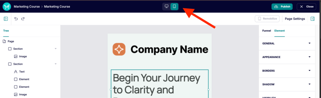
- Click the Mobile button in the top toolbar to switch to Mobile View
- Review the auto-generated mobile layout and make any adjustments needed
Tip: Always complete your desktop design before editing mobile. Any manual change in mobile view disables automatic remobilization, so it is best to finalize your desktop layout first.
Configuring the Mobile Canvas
Basic Mobile Editing
When you switch to Mobile View, the canvas works almost identically to the desktop editor with a few important differences:
- You cannot add new elements in Mobile View — all elements must be added from the Desktop View first
- You can move and resize elements freely within their section without affecting the desktop layout
- Remobilize button — after making any manual change to mobile, a Remobilize button appears in the top toolbar. Click it to re-run the automatic mobile conversion. Note: this will overwrite any manual mobile edits you have made
Hiding and Showing Elements on Mobile
You can show or hide specific elements on mobile independently from the desktop. This lets you create mobile-only elements such as a compact tap-to-call button.
To control element visibility:
- Select the element on the canvas
- In the Element Properties panel, navigate to Visibility to toggle whether it’s visible on Mobile.
- Toggle either option off to make the element invisible on that view — the element is greyed out, not deleted

Important: If you hide an element on mobile and cannot find it, switch back to Desktop View where it will still be visible. From there, toggle Show on Mobile back on.
Customer Experience
When a visitor opens your funnel page on a mobile device (600px or narrower), they will see the mobile version of your page. The layout is fixed — regardless of whether they are on a phone or small tablet, they will always see exactly what you designed in Mobile View. The page adapts fluidly to different screen widths within the mobile breakpoint.
Elements you have hidden using Show on Mobile = off will be completely invisible to mobile visitors. Elements you have set as mobile-only (Show on Desktop = off) will only appear for mobile visitors.
FAQs
- Q: If I move an element in Mobile View, will it affect my desktop layout?
- A: No. Repositioning and resizing elements in Mobile View is completely independent of the desktop layout. However, changing element properties (such as background color or border style) will update both views, since properties are shared globally.
- Q: Can I add new elements while in Mobile View?
- A: No. Elements can only be added from Desktop View. Once added on desktop, they will appear in Mobile View and can be repositioned, resized, or hidden there.
- A: No. Elements can only be added from Desktop View. Once added on desktop, they will appear in Mobile View and can be repositioned, resized, or hidden there.
- Q: What happens if I click Remobilize after customizing my mobile layout?
- A: Remobilize re-runs the automatic mobile conversion algorithm based on your current desktop layout. Any manual changes you have made to the mobile view will be overwritten. Only click Remobilize if you want to start fresh from the auto-generated mobile layout.
- A: Remobilize re-runs the automatic mobile conversion algorithm based on your current desktop layout. Any manual changes you have made to the mobile view will be overwritten. Only click Remobilize if you want to start fresh from the auto-generated mobile layout.
- Q: How do I create a desktop-only element?
- A: Add the element in Desktop View, then toggle Show on Mobile off in Element Properties > Visibility. The element will be visible on desktop but invisible on mobile.
- A: Add the element in Desktop View, then toggle Show on Mobile off in Element Properties > Visibility. The element will be visible on desktop but invisible on mobile.
- Q: Can I create a mobile-only element?
- A: No, at this time it’s only possible to disable elements from mobile view, and so elements added to your checkout will always be visible in desktop view.
- A: No, at this time it’s only possible to disable elements from mobile view, and so elements added to your checkout will always be visible in desktop view.
- Q: I hid an element on mobile and now I can’t find it — what do I do?
- A: Switch back to Desktop View. The element will still be visible there. Select it and toggle Show on Mobile back on, then switch to Mobile View to reposition it.