ThrivePages gives you complete creative control over your sales funnels with a professional canvas-based page builder that eliminates design guesswork. The grid system ensures pixel-perfect alignment across all funnel pages while maintaining responsive design, letting you build high-converting checkout experiences that scale from your first sale to enterprise volume without technical expertise or developer costs.
What is ThrivePages?
ThriveCart’s Editor 2.0, ThrivePages, is a canvas-based page builder for creating complete sales funnels. Unlike previous editors where you worked on individual pages, ThrivePages provides a unified workspace where you design all funnel pages—checkout, upsells, downsells, and success pages—in one interface.
Users familiar with Convertri will be familiar with the layout and functionality of this editor that uses a 200-column grid system that automatically aligns elements with precision. You build pages using sections (full-width containers) and elements (text, images, buttons, videos, checkout forms) that snap to the invisible grid. This gives you the freedom to move elements around, but no fighting with rulers to ensure perfect alignment. Build professional layouts from scratch, or use our pre-built templates. No design experience necessary.
Key capabilities:
- Full funnel editing – Access all pages in your funnel from one interface
- Canvas-based design – Visual workspace at 1280px width with grid guidance
- Flexible positioning – Place elements anywhere within the 200-column grid
- Responsive by default – Pages automatically adapt to mobile, but offer a separate mobile editor for fine-tuning
- Modern performance – React-based architecture for faster editing
- Consistent experience – Same editor works across all ThriveCart apps
The canvas is 1280px wide (optimal desktop viewing width). On larger screens, your page background color displays around the content. On smaller screens, pages automatically adapt using responsive design rules and a mobile-specific grid.
Accessing the Editor & Choosing a Template
To design the checkout for your product, create a product and set it’s name, pricing, and fulfilment information (see more on creating a product in this guide), and then head to the “Checkout” tab.
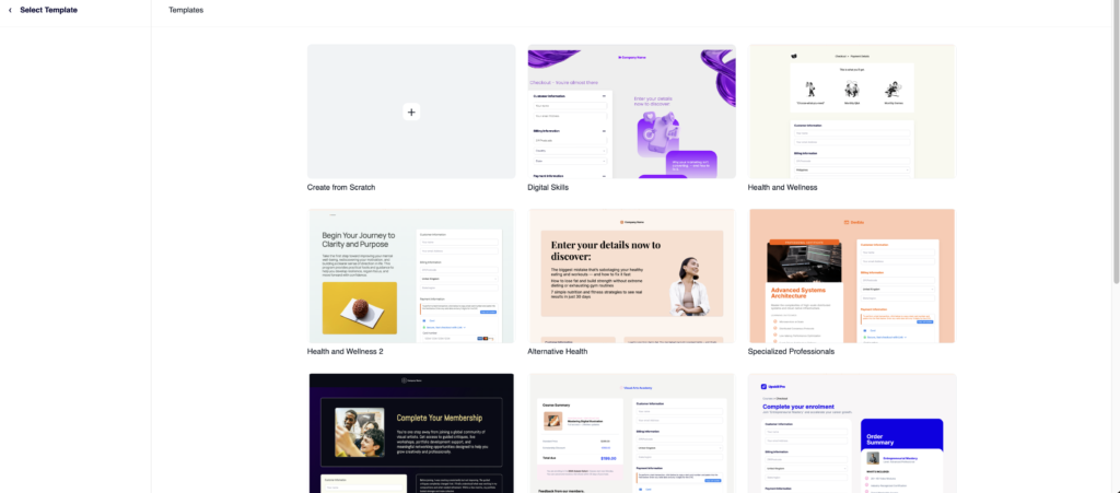
From there you will see the option to choose the “New Editor” or “Old Editor”. Choose the New Editor button (These buttons will say “New Editor” if you’re choosing a template for the first time or “Launch Editor” if you’re returning to a product with an existing design) to open ThrivePages and browse from the pre-built templates available to help kickstart your checkout design.
You’ll have the option to choose from a number of pre-designed and industry-specific templates, or to start with a “Blank Template” where you can build your own from scratch.
Understanding the Editor Interface
The ThrivePages workspace contains three main areas that work together for efficient page building.
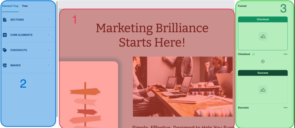
1. Canvas (Center)
Your 1280px-wide design workspace displays exactly how pages will appear to desktop customers. Scroll vertically to see the full page. Click elements to select them, and drag them to reposition within the grid.
This width represents optimal desktop viewing. On larger screens (e.g., 1920px), your page content stays centered at 1280px with the page background color/image displaying on either side. This creates a professional frame around your content.
On smaller screens (tablets, phones), pages automatically adapt using responsive design. The canvas always displays at 1280px during editing so your layout doesn’t shift while you work.
2. Left Sidebar
The Element Tray is where you’ll be able to browse all available elements. Drag and drop those elements onto your canvas and they’ll automatically snap to the grid.
The Tree allows you to view your page structure hierarchically, based on all the elements that you’ve added. This allowed you to navigate complex pages quickly and click any item to automatically open the properties panel for that element.
3. Funnel & Properties Panel (Right Sidebar)
Manage your entire funnel structure. From here, choose to add pages, and click into a page to switch the editor to that specific page:
- Funnel navigation – Thumbnails of all pages, click thumbnail to edit that page
- Page types: Checkout, Upsell, Downsell, Success clearly labeled
- Add pages – Click + buttons to insert new pages anywhere
- Reorder pages – Drag thumbnails to rearrange funnel sequence
- … to delete a page
- Element Properties – Opens the Properties panel for the selected section/element to adjust the look and feel of that selection
In addition to these main work areas, the top toolbars have a number of tools related to editing your specific elements and navigating your funnel pages:
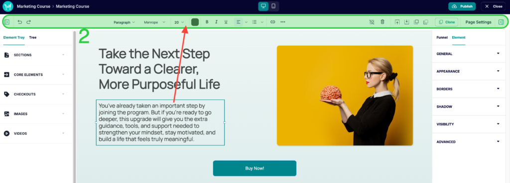
1. Top Blue Toolbar
Quick access to essential tools:
- Product Name > The page you’re editing – helps to distinguish whether you’re currently on an upsell, downsell, checkout page, or success page
- Device selector – Toggle between Desktop and Mobile editing modes
- Publish – Save changes and publish each page
- Close – Exits out of the editor and back to your ThriveCart dashboard product settings. If there are unsaved changes, you’ll be prompted to save & exit.
2. Second Level Toolbar
- Minimize Element Tray – Hide the tray to view/edit the full canvas
- Undo/Redo – Reverse or reapply changes (Ctrl/Cmd + Z / Shift + Z)
- Text Settings – Set font styling and colours (visible only when text is selected – see red arrow)
- Trash Can – delete the selected element/section
- Layering Options – Move elements forward/back by one, or straight to the back/front of other elements
- Clone – Click to clone an element or section
- Page Settings – Your overall page defaults
The Canvas Grid System
Each section in your canvas uses a high-resolution invisible grid that guides element placement for precise, professional alignment. The grid operates in the background at all times but is never visible on the canvas, either while editing or when customers view your published page.
How the grid works:
- High-resolution columns: The desktop canvas uses a very fine grid of 200 columns, with each cell roughly 4–5px wide. This creates a near-freeform editing experience while keeping snapping behavior in place for clean alignment.
- Rows: Unlimited. Sections expand automatically as you add content, and can also be adjusted manually.
- No visible grid lines: The grid preview is intentionally hidden. Rather than editing around visible grid lines, you simply drag elements freely and the grid snaps them into position behind the scenes.
How elements snap to the grid:
When you place or move elements, they automatically snap to the nearest grid cell. Because the cells are so small (~4–5px), this snapping is nearly imperceptible, giving you the freedom of pixel-precise placement without the constraints of a coarse grid. Elements align naturally with each other because they follow the same underlying grid structure.
Grid-Based Layout Techniques
There are no rigid templates forcing you into a predetermined structure. Even if you choose one of our pre-designed templates, you can build on it to create exactly the layout you have in mind. Drag elements into position and resize them to fit your vision.
The result is total creative freedom without the chaos, because the underlying grid keeps everything aligned and proportional no matter how complex your layout gets.
Creating multi-column layouts:
Because element placement is nearly pixel-precise, you can create any column structure you need by sizing and positioning elements manually:
- 2-column layout: Two side-by-side panels of equal width with spacing between them
- 3-column layout: Three equally spaced panels across the section
- 4-column layout: Four panels or elements across the section
- Asymmetric layout: A wider main content area with a narrower sidebar
For visual consistency, align the left edges of stacked elements across rows. For example, if your headline starts at the same horizontal position as your body text below it, those elements will feel visually anchored.
Nested element structures:
Some elements can contain other elements. Use this for advanced layouts:
- Place Text and Button elements inside a Panel to create callout boxes
- Group related elements by positioning them close together to create visual grouping without needing containers
How Your Design Appears to Customers
The benefits of a hidden grid system is that exactly what you design in the editor is what the customers will see on their side, with only slight adjustments based on their screen size.
Desktop experience (600px+ screen width):
- Page displays at up to 1280px wide, centered on screen
- On screens wider than 1280px, the page background color or image fills either side
- Elements are positioned according to your layout
- Spacing and alignment matches what you see in the editor
Mobile experience (below 600px screen width):
- Pages automatically adapt to smaller screens using responsive logic
- Elements reflow top-to-bottom, left-to-right based on their desktop positioning
- You can customize mobile layouts independently using the Mobile editor mode
Tablet experience (600–1280px screen width):
- Pages display using the desktop layout
- Content scales proportionally to screen width
- Elements maintain their relative positioning from your desktop design
How Your Product Setup Controls the Funnel Structure
Product settings are the source of truth for your product configuration. Within the product options editor is where you can set the product’s price, enable bump offers, and set the fulfillment method to link to your products.
Fulfillment Methods
Each of your funnels is always tied to one main product. This main product cannot be changed once the funnel is created, and you’ll be adding upsell/downsell/bump offers to this main product’s funnel. This means that customers will be purchasing this main product before and/or purchasing the additional items in your funnel.
This product’s fulfillment settings determine the fulfillment of the rest of your funnel. So if your main product is a course, then your bumps, upsells, downsells would also use the add to course fulfillment method.
The available fulfillment methods that you can set on your main product include:
- Show Invoice – No fulfillment actions will process, simply the invoice will display on the success page
- Send to URL – URL displayed on success page, with optional URL expiration as determined by product settings
- Add to Membership Site – Automatic enrollment in ThriveCart Learn courses/bundles, or add to 3rd-party platform (WishList Member, MemberMouse, etc.). Will link to Learn login or URL provided in product settings.
Frequently Asked Questions (FAQs):
- Q: How do I know which section I’m editing on a complex page?
- A: When you select a section, it displays an orange border. Section controls (drag handle, settings, delete) appear at the top-right. You can also use the Layer Tree in the left sidebar to see page structure and click sections by name. Name your sections descriptively in the Properties Panel → Element name field for easier navigation.
- Q: Can I copy sections from one page to another?
- A: Yes. Select the section, press Ctrl/Cmd + C to copy, then switch to another page in the Funnel Panel and press Ctrl/Cmd + V to paste. The section and all its elements will be duplicated to the new page with the same grid positioning.
- Q: What happens if I make my canvas wider than 1280px by adding very wide elements?
- A: You can’t exceed the 1280px canvas width. Sections are locked to 1280px and elements cannot go outside this border. This ensures your pages look consistent across devices and don’t break responsive design.