
The student home page is the first thing your students see every time they log in. ThriveAcademy gives you a composable canvas to build that experience exactly the way you want it, with content blocks you can add, reorder, configure, and style independently, without writing any code.
Every home page starts with default blocks so new student dashboards are never empty. From there, creators can customize blocks using a template picker, configure curation and layout per block, set individual color schemes, and link ThriveCart checkouts directly from the home page.
What Is the Home Page Canvas?
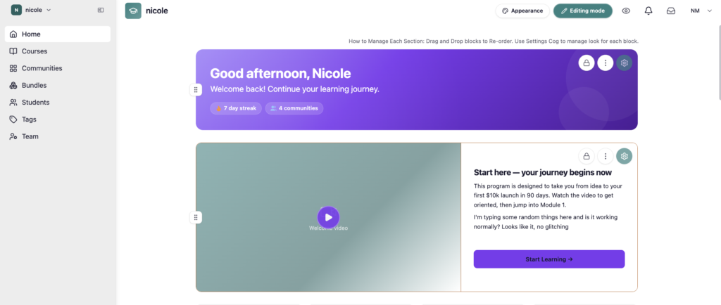
The home page canvas is a layout tool that lets you compose your student home page from a set of content blocks. Each block is an independent unit with its own settings panel, its own style palette, and its own curation logic. What you build is exactly what students see when they land on your home page.
There are a number of blocks built-in to the Homepage, so that students never land on an empty home and can easily locate their courses and communities, but built-in blocks can be hidden and/or additional blocks added – up to a maximum of 10 blocks.
Available block types:
| Block Type | Preset | What It Does |
| Welcome Hero Banner | Built-in – can add multiples | Hero banner showing the students name, current streak day and count of registered communities |
| Stats Row | Built-in | Four available stats tabs showing the number of courses enrolled, courses completed, certificates earned, and lessons this week. All 4 are enabled by default, but each stat can be disabled individually. |
| HTML | Built-in (initial built in block not counted toward your total blocks) – can add additional blocks | Add custom HTML or CSS to the page |
| Jump Back In | Built-in (but not counted toward your total blocks) | No manual configuration required, simply shows students the next module & lesson from their recently accessed course to automatically jump back in. |
| Course List | Built-in | Displays a curated set of courses; supports auto or manual curation, sorting, filtering, Grid or Carousel layout. |
| Communities | Built-in | Lists of communities the student is enrolled in. |
| Video + HTML | Built-in – can add multiples | Side-by-side layout with a video player on one side and text/HTML on the other; split ratio and video position are fully configurable. |
| Custom | Additional Block | Adds a simple text block |
| More from this creator | Built-in | Showcases courses and communities that the student is not registered for, as well as bundles synced from your ThriveCart account, linking to the product to purchase in order to unlock that content. |
| Discover Courses | Additional Block | Showing only available courses students haven’t purchased yet; includes search and featured content; locked items show a purchase CTA. |
| Discover Communities | Additional Block | Similar to the above, but for communities specifically |
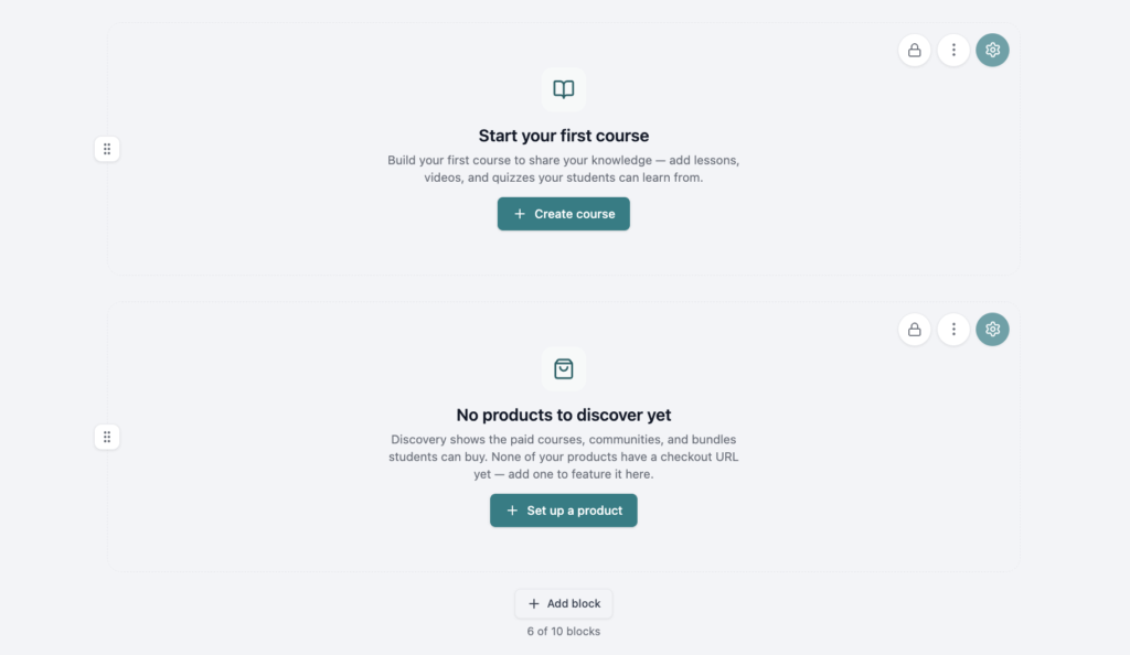
If you’re logging in to Academy for the first time, your Home Page blocks will show “Create” buttons for content that does not currently exist yet, such as to create courses and communities. For the discover blocks, if you do not have any ThriveCart products linked in your course or community settings, then it will also instruct you to set those up.
Quick Setup: Build Your Home Page in 3 Steps
1. Open the Home Page Editor
Log into ThriveAcademy as a creator and navigate to Home in the left sidebar. Click Edit Home to enter editing mode. The topbar switches to show an Editing / Preview toggle so you can switch between your live canvas and the student-facing view at any time without leaving the editor.
2. Configure, Style, and Save
Click the cog in the top right of any built-in block to open its settings panel. Set your curation rules, layout preference, and style options, then use the Preview toggle (eyeball icon in the top right menu) to see exactly what students will see. Your changes save automatically as you work.
3. Add additional blocks, delete or hide blocks, and re-arrange
Click the “+ Add Block” button at the bottom of the home page to add additional blocks, up to a maximum of 10. Grab the 6 dots on the left of a block to move it around the page, or click the 3 dot menu to move blocks up/down or delete.
Configuring Your Blocks
Every block has a settings panel with options specific to its type. Here is what each block type exposes:
Welcome Hero Banner
- Welcome message customized depending on the time of day and including the students name, i.e. “Good afternoon, Sandra”
- Upload a logo
- Adjust the subtitle text
Stats Row
- Set the card colors
- Choose the stats to show (via enable/disable checkbox) including:
- Courses enrolled
- Courses completed
- Certificates earned
- Lessons this week (shows # of completed lessons)
Video + HTML
- Supports uploaded video only [paid subscription plan required – to embed video, utilize the Custom block]
- Can choose between pre-designed layouts
- Video + HTML side-by-side
- Video only
- HTML only
- Video Settings:
- Left or right
- Video stacks vertically on mobile automatically
- Enable playback loop, mute on start, and/or autoplay
- Heading text and body copy
- CTA button label and link destination: automatically links to their most recent course and next lesson, or opens their community if they do not have an active course.
- Alternatively, set a custom URL to override the default link
- Block-level background color, text color, and accent color
Custom
- Full rich-text editor with HTML passthrough support
- Custom CSS is preserved (not stripped)
- Autosaves content as you type
Course & Communities Blocks
Will show only what a student is registered for, based on the blocks settings:
- Sort: By last or most visited, or alphabetically
- Filter: Restrict based on whether the student’s course is In Progress, Completed, Not Started, or show all courses (default)
- Layout: Grid (cards fill the full row width) or Carousel (horizontally scrollable)
- Max cards: Set the maximum number of courses displayed in the block
- Card Style: Set the individual card colors and style, if different from the global page settings
Discovery Blocks
Will show anything that the student is not already registered for, based on the blocks settings:
- Displays courses and communities students do not yet have access to
- Can set content to “Auto” to show all available courses (default) and their checkout links via the CTA button. Checkout links are generated based on the product linked in the course or community settings.
- “Manual” content allows for a creator-customized showcase of available courses and communities for purchase.
- Can be a grid or carousel layout.
Configuration Notes
Show/Hide section
Each section can be hidden by disabling the “Show section” toggle found within that blocks settings.
Per-Block Card Styles
Many blocks have an independent style palette accessible from its settings panel. You can set:
- Card text tone: the main text throughout the card
- Card colour: the background colour for the entire card, as well as the tone of the badges on top of the images (i.e. “Member” and “Get Started”)
- CTA button colour: The background colour of the button on the card
- CTA text colour: The colour of the button text
Colors are applied using block-scoped CSS variables, which means changing one block’s palette never affects any other block on the page, unless the “Apply to all sections” button is clicked. Color values are hex-validated so pasted values are checked before saving.
If you’re wanting to set an overall default, this can be done via the Appearance button on the top right, or you can also click the “Apply to all sections” button when editing a card style.
Inline Checkout
The Discovery block supports an inline checkout link. This wires a ThriveCart product directly to a CTA on the block, so students can purchase without leaving the home page.
The checkout link to access those courses/communities is based on the product linked within that course or community settings.
Reorder blocks
Blocks can be moved around the bag by dragging/dropping the handle on the left, or by using the ⋮ (more) menu on any block to access:
- Move up
- Move down
- Move to top
- Move to bottom
Delete a block by clicking the ⋮ menu and selecting Delete, then confirming the alert dialog. Deleting a block removes it permanently and cleans up its reference from the page order automatically. Only additional blocks can be deleted. Pre-built blocks can only be hidden.
Block cap: You can add a maximum of 10 blocks per home page. The + Add block button disables automatically when the cap is reached.
The Student Home Page Experience
Students land on your configured home page every time they log in. Here is what they see based on your setup:
- Blocks render in the order you set, with your styling applied
- The Discovery blocks personalize automatically: it shows only content the student does not currently have access to, so returning students never see an irrelevant list of things they already own
- Course List blocks surface the student’s actual enrollment and progress context, including resume CTAs on in-progress courses
- The home page adapts to mobile automatically: carousel layouts scroll horizontally, Video + HTML blocks stack vertically, and drag handles are hidden
Default Home for new accounts: If you have not yet customized your home page, students see a default layout with a single combined Discovery block. The first time you make any change in the editor (add, reorder, configure, or restyle a block), your configuration is saved and replaces the default going forward.
FAQs
- Q: Can I preview exactly what a student will see before publishing changes?
- A: Yes. Use the eyeball icon in the top bar at any time while in the editor to toggle between editing and preview modes. Preview renders the student-facing view using your current configuration. There is no separate publish step; changes save automatically as you work.
- A: Yes. Use the eyeball icon in the top bar at any time while in the editor to toggle between editing and preview modes. Preview renders the student-facing view using your current configuration. There is no separate publish step; changes save automatically as you work.
- Q: The CTA button color on my Banner block does not match what I set. What should I check?
- A: The Banner CTA button honors the global CTA color set in your Appearance settings by default. To override it for a specific block, open the block style palette and set a custom Accent color. The block-level setting takes priority over the global setting.
- A: The Banner CTA button honors the global CTA color set in your Appearance settings by default. To override it for a specific block, open the block style palette and set a custom Accent color. The block-level setting takes priority over the global setting.
- Q: Can I use the same home page customization for individual courses or communities?
- A: No. The home page canvas is scoped to the student home page only. Course and community pages have their own independent settings. If you set a background in Appearance, make sure “Apply to entire academy” is de-selected to avoid it applying site-wide.